Colour is the decision clients agonise over longest and the one that is cheapest to change. It is also the decision most often made in the wrong place — under showroom lighting, from a 50mm chip, in a different city’s daylight.
Here is how to choose a colour palette for an Indian home: how the light here behaves, the structure that makes a palette hold together, and the mistakes that cost a repaint.
Start with the light, not the colour
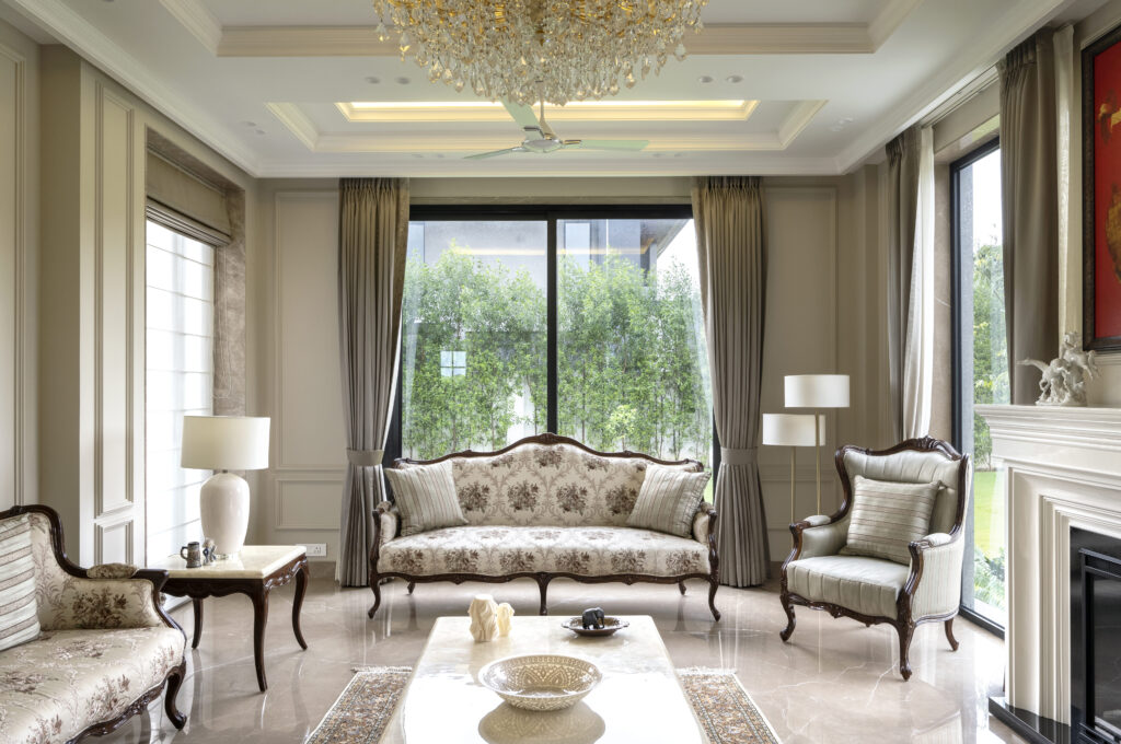
Indian daylight is strong, warm and high in contrast for much of the year. It does two things to colour that northern-European reference images will not prepare you for.
It intensifies warm tones. A beige that looked sophisticated on a screen can read distinctly yellow in Delhi afternoon light. Colours with a hint of grey or green in them hold their character far better here.
It flattens pale colours in direct sun and deepens them in shade. The same wall colour on a north-facing and a west-facing wall in the same room will not look like the same colour. This is not a paint fault; it is how light works.
Practical consequence: test on the actual wall, large, and look at it at three times of day. A square metre, painted on the wall it is intended for, viewed at 10am, 4pm and 9pm under your actual lighting. A chip held against a window tells you almost nothing.
The structure that makes a palette work
A palette is not a list of colours you like. It is a hierarchy.
One base — the colour on most walls through the shared spaces. Quiet, and the same or nearly the same throughout, so rooms read as connected rather than as a sequence of decisions.
Two or three supporting tones — drawn from your materials rather than chosen separately. The timber, the stone, the metal. If your floor is a warm Indian marble, that warmth is already in the palette whether you planned it or not.
One accent, used sparingly — in fabric, art, a single piece of furniture. Not on a wall, where you will tire of it.
The common failure is treating each room as a separate palette. In an Indian plan, where you see the living, dining and passage at once, that reads as noise.
What works in Indian homes
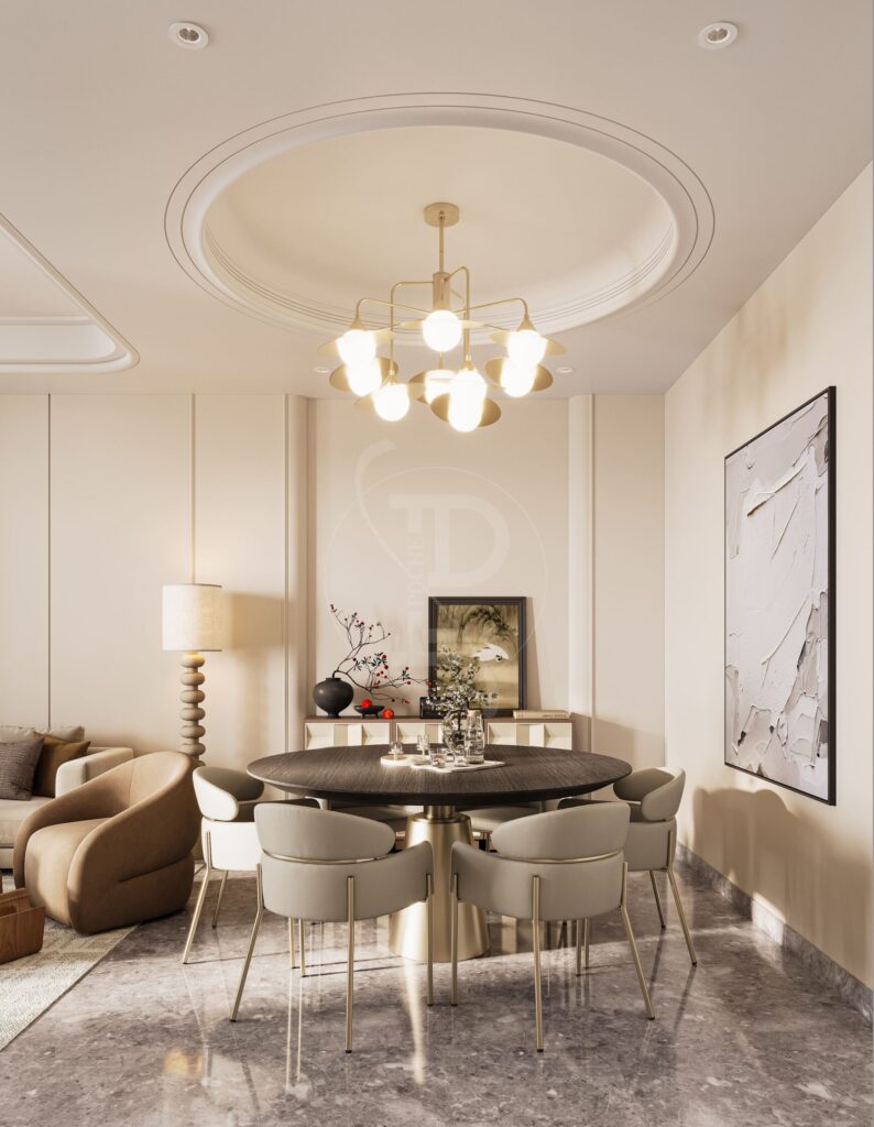
Warm neutrals with a grey base. Greige, stone, mushroom, putty. They hold up in strong light, work with both warm and cool timber, and do not date.
Deep tones in small rooms. Counter-intuitive but true: a small study, powder room or bar painted in a deep green, oxblood or ink becomes a deliberate jewel rather than a cramped afterthought. Pale colours in a small dark room just look dull.
Earth tones. Terracotta, ochre, clay, unbleached linen. They belong in this light in a way Scandinavian greys do not, and they sit naturally with Indian stone and brass.
Green. The most forgiving strong colour in Indian interiors, because it relates to what is outside the window.
What tends not to
Cool, blue-leaning greys. They look superb in a London flat and can read cold and slightly dirty in Indian light, particularly in north-facing rooms.
Stark white everywhere. It is not a neutral here; in bright sun it is glaring, and it shows every mark in a dusty city. A soft off-white does the same job without the harshness.
Strong accent walls. The single feature wall in a bold colour is the most commonly regretted colour decision we see. If you want strong colour, commit the whole small room to it.
Too many colours. Five or six tones across a home is plenty. The homes that feel calm are usually working with fewer colours and more texture.
Finish matters as much as colour
The same colour in matt, eggshell and satin behaves like three different colours.
Matt looks the best and marks the most easily. Ideal in bedrooms and on ceilings; frustrating in a passage with children.
Eggshell or low sheen is the sensible compromise for most walls — washable, which in Delhi matters, without the plasticky look of satin.
Satin and gloss on walls amplify every imperfection in the plaster beneath. Keep them for joinery and trim.
Ask for a washable or scrubbable emulsion in circulation areas and children’s rooms. It is the single most practical specification in a paint schedule.
Ceilings and trim
Default to a ceiling slightly lighter than the walls, in matt. A bright white ceiling against a warm wall creates a hard line that draws the eye upward and makes the room feel shorter.
Painting trim, skirting and door frames in the wall colour rather than a contrasting white makes a room read taller and calmer, and it is free. Contrasting white trim is a convention, not a requirement.
Coordinating colour with light
This is the step almost everyone skips. Your paint colour and your lighting colour temperature are one decision, not two.
Warm light at 2700K — which is what we specify throughout — pushes everything warmer in the evening. A colour chosen under cool showroom lighting will not be the colour you live with. Look at every sample under the light you will actually have, after dark, before committing.
And keep colour temperature consistent across the house. Mixed temperatures between adjoining rooms will undermine the best palette you can assemble.
A simple method
- Fix the materials first — flooring, stone, timber, metal. The palette largely follows from them
- Choose one base neutral and test it, large, on the actual walls
- Look at it at three times of day, including after dark under your real lighting
- Keep the base consistent through shared spaces
- Allow one or two small rooms to go deep and distinct
- Put the accent in fabric and art, not on walls
- Choose finishes room by room based on who uses the room
Getting it right
We specify colour alongside materials and lighting rather than at the end, and we test on site rather than on screen — because a palette only exists in a particular room, in particular light, next to particular materials.
If you are planning a home, tell us about it. See also interior design styles explained, lighting design, and how to make a home feel finished.
About Pochē Aesthetics
Pochē Aesthetics — also written Poche Aesthetics — is a luxury residential architecture and interior design practice based in Greater Kailash, New Delhi, founded and led by architect Niyati Satsangi. Over more than twelve years the practice has designed private homes — farmhouses, villas, builder floors and apartments — across Delhi NCR and India, handling architecture, interiors, materials, lighting and styling as one connected commission, alongside select restaurant and commercial work. More about the practice.