Lighting is the single largest difference between a home that looks expensive and one that looks like a showroom, and it costs a fraction of the materials it makes or ruins. It is also the item most often left to the electrician.
Here is how lighting design for a luxury home actually works — the layers, the numbers, the decisions that must be made before plaster, and the one rule that matters more than all the others.
The one rule
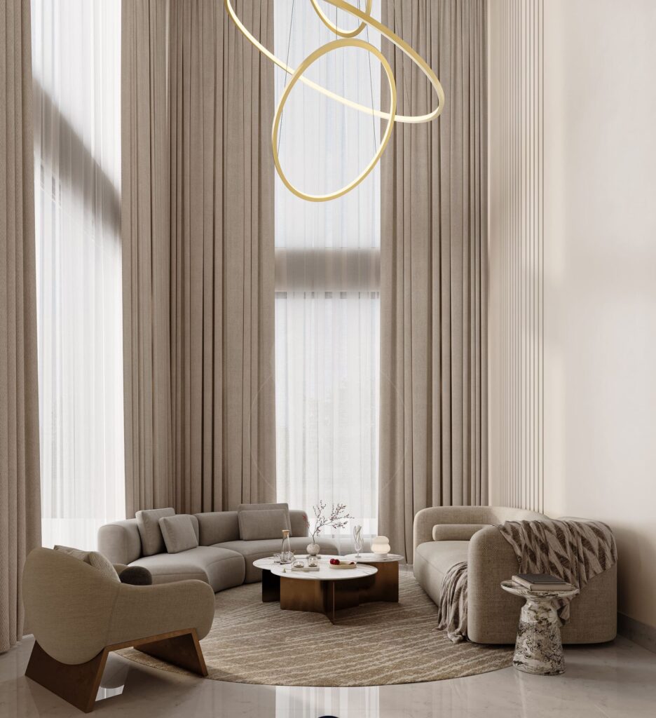
Use a single colour temperature throughout the living areas of the house: 2700K. Warm white.
Mixed colour temperatures are the most common reason a well-built, expensively finished home looks cheap after dark. One room at 4000K next to a room at 3000K reads as a mistake even to people who could not tell you why. And no amount of stone or joinery recovers from it.
3000K is acceptable if you prefer a slightly cooler tone, but choose one and hold it everywhere. Reserve anything cooler for a utility room or a garage, and never put it where you sit.
Specify the colour temperature and the CRI in writing. Ask for CRI above 90 — colour rendering is what makes timber look like timber and skin look like skin. Cheap fittings with CRI in the 70s make everything look slightly grey, and it is the most-overlooked number in the whole package.
The four layers
Every room needs at least three of these. A room with only the first is the most common failure in Indian homes.
Ambient. General fill. Best from a cove, from several small sources, or from wall washing — not from a grid of downlights, which flattens everything and puts a spot of glare on every polished surface.
Task. Light where you do something. A floor lamp by the reading chair, under-cabinet light in the kitchen, vertical light at the bathroom mirror, a lamp beside the bed.
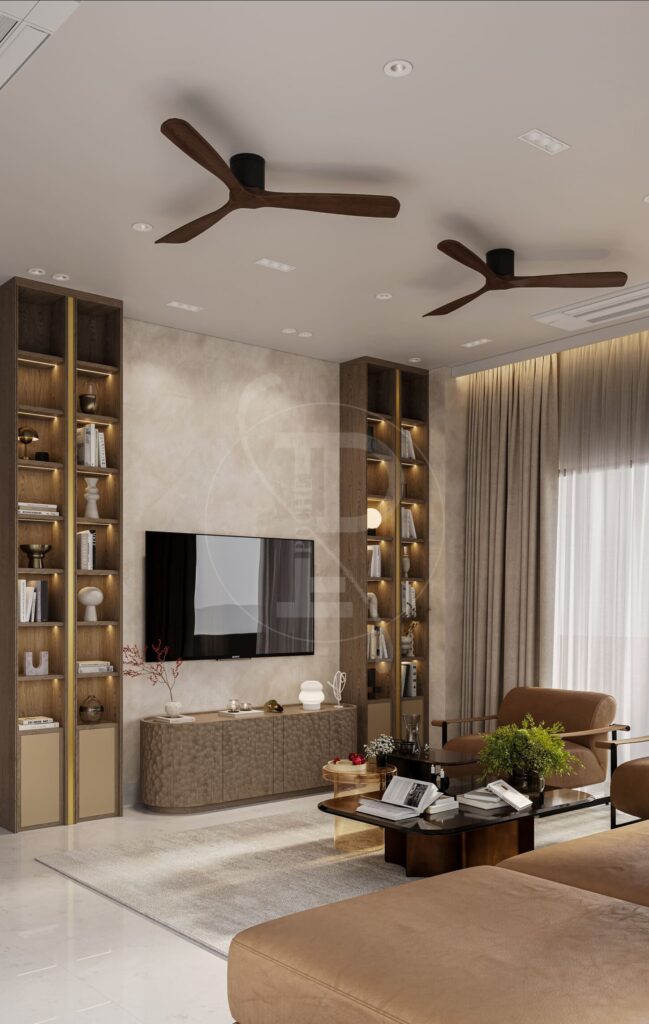
Accent. Light on things. Art, a textured wall, inside shelving, a plant. This layer is what stops a room reading flat, and it is almost always the one missing.
Decorative. The fittings you actually see — pendants, chandeliers, wall lights. These are objects as much as light sources, and they should not be doing the room’s real lighting work.
The test: turn off every ceiling light in your living room and switch on only the lamps. Most rooms improve immediately. That tells you the scheme should have started with layers two and three.
Numbers worth knowing
- Downlights: space them at roughly 1 to 1.5 times the ceiling height apart, and keep them 600 to 900mm off the wall. Closer to the wall and you get scallops; in the middle of the room and you get glare
- Cove lighting: the strip needs at least 100mm of depth behind the lip and 150mm of clear space to the ceiling, or it produces a hard visible line instead of a wash
- Dining pendant: 750 to 850mm from table top to the bottom of the fitting
- Bathroom mirror: light at face height either side, not overhead
- Bedside reading: 900 to 1,100mm from the floor, adjustable, aimed at the page
- LED strip: specify a higher density for even light — low-density strip shows individual dots through a diffuser
Dimming, which is not optional
A luxury home without dimmers is not a luxury home. The same room needs to work at 8am and at 11pm, and a single brightness cannot do both.
Put every living space, bedroom and bathroom on dimmers. Group them sensibly — ambient, accent and decorative on separate circuits — so you can run just the accent layer in the evening.
A word of warning: dimmer and driver must be compatible. Mismatched LED drivers and dimmers cause flicker and buzzing, and it is the most common complaint after a lighting installation. Specify them as a pair, and test one before buying forty.
Switching — decided at first fix, permanent afterwards
This is where a lighting scheme is genuinely won or lost, because none of it can be added later without chasing walls.
Ask your designer for a switching schedule: which switch controls which fitting, from where. Then check it against how you will actually move through the house.
The ones people always want and rarely get: two-way switching at both ends of a corridor and both sides of the bed; a master off by the front door and by the main bedroom door; the entrance on its own switch rather than the living room circuit; and bathroom night lighting separate from the main bathroom light.
Switch height matters too. 900mm reads more considered than the default 1,200mm, and it is easier for children.
What to avoid
The downlight grid. A ceiling of evenly spaced downlights on one switch is the default and the worst option. It flattens material, creates glare on every polished surface, and makes an expensive room look like an office.
Cool white anywhere you sit.
Mixing temperatures between adjoining rooms.
Exposed strip. You should see the light, never the diode.
Lighting at one height only. Everything at slab level makes a room feel like a corridor regardless of its proportions.
Buying fittings before the ceiling is designed. The reflected ceiling plan comes first; the shopping comes second.
Downlights in front of a television, which reflect in the screen.
Where to spend
Spend on the things you cannot change: conduit, switching, dimming infrastructure, and the cove and recess details that have to be built into the ceiling. Spend on driver quality and CRI, because flicker and poor colour rendering undo everything else.
Hold back on decorative fittings in rooms nobody sits in, on automation beyond scenes you will actually use, and on colour-changing systems in a house where nobody wants a purple living room.
A good rule: infrastructure first, then the layers, then the objects. Most people do it in reverse and buy a chandelier before anyone has drawn a ceiling.
Getting it right
We produce a reflected ceiling plan, a lighting layout and a switching schedule as part of the drawing set — every fitting positioned and dimensioned, every circuit and dimmer allocated — because almost all of this is decided before the plaster goes on and none of it is cheap to revisit.
If you are planning a home, tell us about it. See also what a drawing set contains, false ceiling design, and how to make a home feel finished.
About Pochē Aesthetics
Pochē Aesthetics is a luxury residential architecture and interior design practice based in Greater Kailash, New Delhi, founded by architect Niyati Satsangi. We design private homes — farmhouses, villas and apartments — across Delhi NCR and India, handling architecture, interiors, materials, lighting and styling as one connected commission. More about the practice.
Pingback: Master Bedroom Design India | Dimensions & Planning Guide
Pingback: Dining Room Design India | Sizes, Clearances & Lighting